
Understanding Printer Paper Colors
What Is Printer Paper Colour? – Definition and significance of paper colour in printing
In the labyrinth of printing, the significance of printer paper colour often remains underestimated. It’s more than just a visual choice; it’s an unspoken language that influences perception and communication. The colour of the paper can evoke emotions, convey professionalism, and even shape the reader’s understanding of the content. When we consider printer paper colour, we’re delving into an aspect that subtly guides the human psyche—who would have thought that a simple hue could carry such weight?
Understanding printer paper colour involves recognising its role in context and purpose. For instance, crisp white paper often signifies clarity and purity, making it ideal for official documents. Meanwhile, pastel or coloured papers bring a touch of personality and creativity to presentations or marketing materials. The choice isn’t arbitrary; it’s a reflection of intent—an unspoken message delivered through hue. Sometimes, the colour of the paper can even influence the reader’s mood, turning a mundane printout into a meaningful experience.
Common Printer Paper Colours – Overview of typical colours used in print materials
Understanding printer paper colours reveals a world of subtle messaging and strategic choice. Most printers are designed to handle a variety of colours, each serving a specific purpose in professional and creative settings.
Common printer paper colours include crisp white, pastel hues, and vibrant shades. White paper remains the standard for official documents due to its clarity and neutrality. Pastel shades like light blue, pink, or beige are often used for presentations or personalised stationery, adding a touch of personality without overpowering the content. Bright colours, such as yellow or green, are more suited for marketing materials or attention-grabbing flyers.
- White: Symbolises purity, professionalism, and clarity.
- Pastel shades: Convey subtlety, creativity, and approachability.
- Bright colours: Aim to attract attention and evoke energy.
Choosing the right printer paper colour isn’t merely aesthetic; it can influence perception, mood, and message delivery.
How Colour Impacts Printing Quality – Influence of paper colour on printed images and text
Printer paper colour plays a crucial role in the overall quality and clarity of printed images and text. Different shades can either enhance or diminish the sharpness of your output. For example, white paper provides the best contrast for black ink, ensuring crisp and professional-looking documents. Conversely, coloured paper can sometimes cause ink to appear muted or less vibrant, affecting the perception of your print quality.
Understanding how colour impacts printing quality is essential. Light pastel shades may soften images and give a subtle touch, while vibrant hues can make important details pop. However, choosing the right printer paper colour depends on your specific needs. For instance, high-contrast white paper is ideal for official reports, whereas coloured paper adds personality to creative projects. Recognising these nuances ensures your print results meet expectations every time.
Types of Printer Paper Colours
Standard White Paper – Most commonly used printer paper and its benefits
Among the spectrum of printer paper colours, standard white paper remains the perennial favourite for its clarity and versatility. Its crisp, neutral tone provides the perfect backdrop for professional documents, ensuring that text and images stand out with ease. The simplicity of white paper makes it an ideal choice for printing reports, official correspondence, or any material where readability is paramount.
Beyond aesthetic appeal, the benefits of choosing the right printer paper colour can’t be overstated. White paper’s reflective surface enhances ink vibrancy, resulting in sharper print quality and more vivid colours. This is especially true when printing detailed graphics or intricate designs, where colour accuracy is crucial. Its widespread availability and cost-effectiveness make it the go-to option for many businesses and individuals alike.
In fact, the significance of selecting the appropriate printer paper colour extends past mere visuals. It influences the perception of professionalism and helps maintain consistency across printed materials. Whether for everyday printing or special presentations, standard white paper offers a reliable and timeless solution, ensuring every page communicates with clarity and confidence.
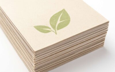
Recycled and Off-White Papers – Eco-friendly options and their colour varieties
Eco-friendly printing isn’t just a noble cause; it’s a savvy choice for those who want to make a statement without shouting. Recycled and off-white papers are gaining traction as sustainable options that also bring a touch of understated elegance to your printed materials. These alternative printer paper colour varieties are often softer on the eyes and lend a vintage or artisanal flair that white paper simply can’t match.
Recycled paper, in particular, comes in an array of shades — from pale cream to warm beige — each adding a subtle character to your documents. Off-white papers, with their muted tones, can help reduce glare and make long reading sessions less taxing. This colour variety isn’t just about aesthetics; it also signals environmental awareness and a commitment to responsible resource use.
For those who prefer variety, many suppliers offer a curated selection of recycled and off-white papers, ensuring your printing projects stand out with a colour palette that’s both eco-conscious and visually appealing. After all, choosing the right printer paper colour isn’t just about looks; it’s about making a conscious choice that echoes your values while enhancing print quality.
Pastel and Light-Coloured Papers – Uses and advantages of pastel shades in printing
Pastel and light-coloured papers are the understated heroes of the printing world. With their gentle hues, they turn mundane documents into visual poetry without shouting for attention. These soft shades are perfect for projects where readability and subtlety matter—think invitations, menus, or premium business reports. They provide a serene backdrop that enhances the clarity of text and images, making your print stand out in the best way possible.
One of the biggest advantages of choosing pastel shades in printer paper colour is reducing glare. This means less eye strain during long reading sessions and an overall more comfortable viewing experience. Plus, these colours can lend a vintage or artisanal touch, adding character without overwhelming the content. Whether you opt for baby blue, blush pink, or mint green, the colour palette offers a sophisticated alternative to stark white paper.
For those seeking versatility, some suppliers offer a curated selection of light-coloured papers, which can be used across various printing needs. The key is balancing aesthetic appeal with practical benefits—after all, choosing the right printer paper colour can subtly elevate your brand image while ensuring crisp print quality.
Colored Printer Paper – Bright and vivid colours for creative projects
Vivid, eye-catching hues have revolutionised the realm of printer paper colour, transforming ordinary printing into a dynamic visual experience. Bright colours such as scarlet red, electric blue, and neon green aren’t just for artistic projects—they serve as powerful tools for branding, marketing, and creative expression. When used strategically, coloured printer paper can evoke emotion, direct attention, and make your printed materials stand out in a sea of sameness.
For design professionals and creative entrepreneurs, the choice of paper colour extends beyond mere aesthetics. It’s a subtle language that communicates personality and intent. From vibrant flyers to lively presentation decks, the spectrum of coloured printer paper opens a world of possibilities. Incorporating bold colours enhances visual impact, especially when contrasted with darker or neutral tones, adding a layer of sophistication and vibrancy that plain white paper simply cannot match.
Often, the decision hinges on the specific project requirements. For instance, a marketing brochure may utilise a palette of bright colours to emphasise key messages, while a creative portfolio might feature coloured papers to showcase artistic flair. The versatility of coloured printer paper makes it a favourite for those who refuse to be confined by conventional standards.
- Red for urgency and passion
- Yellow for optimism and energy
- Blue for trust and professionalism
Factors to Consider When Choosing Printer Paper Colour
Purpose of Printing – How the print job influences colour choice
Choosing the right printer paper colour isn’t just about aesthetics; it’s about aligning your print job with its purpose. For instance, formal documents like contracts or reports thrive on classic white paper, which offers clarity and professionalism. On the other hand, marketing materials or creative projects might benefit from coloured printer paper, making them stand out and capture attention.
The colour of your printer paper can influence readability, visual impact, and even the mood conveyed. Light pastel shades lend a subtle elegance to invitations, while vibrant hues can energise flyers or posters. When selecting printer paper colour, consider the nature of the print job and the audience it’s aimed at. A strategic choice in paper colour can elevate your entire project, ensuring your message isn’t lost in a sea of plainness.
Type of Content – Text, images, or promotional materials and suitable colours
Choosing the appropriate printer paper colour extends beyond mere visual appeal; it fundamentally influences how your message is perceived. When considering the type of content—be it textual, visual, or promotional—certain colours naturally resonate more effectively. For example, crisp white paper enhances the clarity of detailed text, ensuring that your message remains sharp and professional. Conversely, vibrant or pastel shades can add personality and flair to creative or marketing materials, capturing attention instantly.
For printed images and photographs, the choice of printer paper colour can dramatically alter the visual impact. Light-coloured backgrounds such as cream or pale beige can soften the overall look, creating a sophisticated aesthetic. Meanwhile, bold colours like red or blue are ideal for promotional materials aiming to energise and engage audiences. When selecting the best printer paper colour, consider the mood you wish to evoke and the environment where the print will be displayed. A well-curated palette of printer paper colour can turn an ordinary print job into an exceptional visual statement.
Printer Compatibility – Ensuring printer support for different paper colours and textures
Choosing the right printer paper colour isn’t merely about aesthetics; it’s a delicate dance between compatibility and visual harmony. As printers become increasingly sophisticated, ensuring that your selected paper supports the desired outcome is paramount. Not all printer paper colour options are universally compatible, and overlooking this can result in smudging, misalignment, or subpar print quality.
Many modern printers are designed to support a variety of paper textures and colours, but it’s essential to verify this compatibility beforehand. For instance, thicker or textured papers may require specific printer settings or specialised hardware.
- Check your printer’s specifications for supported paper types
- Verify maximum weight capacity for different printer paper colour
- Test with sample sheets before committing to large runs
This due diligence helps you avoid costly mishaps and ensures your vibrant or pastel printer paper colour choices translate beautifully onto paper, enhancing every detail of your print job. After all, the harmony between printer and paper is what elevates an ordinary print into a true work of art.”
Visual Impact and Readability – Contrast, attraction, and ease of reading with various colours
The choice of printer paper colour can dramatically influence the visual impact and readability of your print material. A carefully selected hue creates a subtle yet powerful contrast that guides the viewer’s eye and emphasises key information. Bright, vivid colours can attract attention and evoke emotion, but they must be balanced with readability to avoid overwhelming the content. Conversely, softer pastels or off-white shades provide a calming backdrop that enhances clarity without sacrificing style.
When considering printer paper colour, think about the purpose of your print job. For promotional materials, vibrant colours may generate excitement, while muted tones suit professional reports. The interplay of contrast and attraction determines whether your message resonates or remains unnoticed. Ensuring the right shade not only elevates aesthetic appeal but also facilitates ease of reading, making your printed piece both beautiful and functional.
Benefits of Using Different Printer Paper Colours
Enhancing Visual Appeal – How coloured paper can make documents stand out
Imagine a world where your documents don’t just communicate—they captivate. The secret lies in the subtle power of printer paper colour. Vibrant, coloured paper can transform mundane reports into eye-catching presentations, instantly grabbing attention and leaving a lasting impression. The right choice of printer paper colour enhances visual appeal, making your content not only more attractive but also easier to distinguish.
Choosing coloured printer paper isn’t just about aesthetics; it’s a strategic move for clarity and emphasis. For instance, pastel shades can soften the tone while still providing enough contrast for easy reading. Bright, vivid colours, on the other hand, can highlight key points or serve as a creative background for promotional materials. This versatility makes coloured printer paper an invaluable tool for elevating your printed projects.
- Improved contrast between text and background
- Enhanced visual hierarchy for different sections
- Increased engagement through colour differentiation
In a competitive world, making your documents stand out isn’t an option—it’s essential. The deliberate application of printer paper colour can turn an ordinary report into a compelling visual narrative, captivating your audience from the first glance. Whether for marketing, educational materials, or creative projects, coloured printer paper offers a powerful way to communicate with impact and style. It’s not just paper; it’s your silent ambassador in the realm of print design.
Branding and Marketing – Using colours to reinforce brand identity
Choosing the right printer paper colour can significantly influence how your brand is perceived. Different colours evoke distinct emotions and can reinforce your brand identity seamlessly. For example, a company specialising in eco-friendly products might opt for recycled or off-white paper, subtly signalling sustainability. Bright, vivid colours, on the other hand, are perfect for promotional materials that need to grab attention quickly.
Using varied printer paper colour in your marketing campaigns creates a visual hierarchy that guides the reader’s eye and emphasizes key messages. Incorporating colour strategically not only enhances aesthetic appeal but also helps improve readability and engagement. When selecting printer paper colour, consider how it complements your content and the impression you want to leave—after all, colour is a powerful, silent ambassador for your brand.
Organizational Purposes – Color-coded documents for better management
Using different printer paper colour can transform document management and organisation within your workspace. Colour-coded files streamline workflows, reduce errors, and make retrieval efficient. For instance, assigning specific colours to categories such as invoices, reports, or memos allows teams to quickly identify essential documents at a glance. This visual system saves time and enhances overall productivity.
Incorporating varied printer paper colour isn’t just about aesthetics. It also boosts clarity and minimises confusion. When each type of document has a designated colour, it’s easier to maintain order, especially in busy offices or large teams. The strategic use of colours can turn a cluttered filing system into a well-oiled machine, ensuring that critical information is never misplaced or overlooked.
Whether opting for vibrant shades or subdued pastels, selecting appropriate printer paper colours depends on your organisational needs. Embrace the power of colour to create a more efficient, engaging environment. After all, the right paper colour can make a significant difference in how your documents are managed and perceived!
Creative and Artistic Uses – Creative projects that benefit from coloured paper
Coloured printer paper opens a realm of creative possibilities that can transform ordinary projects into captivating visual tales. Whether you’re crafting handmade cards, eye-catching flyers, or unique craft projects, the choice of printer paper colour can elevate your work from mundane to mesmerising. Bright hues like crimson or electric blue immediately draw attention, while softer pastel shades lend a subtle elegance that’s perfect for invitations or delicate artwork.
Using different printer paper colour can also enhance the emotional impact of your creations. Vibrant colours evoke energy and enthusiasm, ideal for promotional materials or children’s activities. Conversely, muted tones foster a sense of calm and sophistication, suitable for formal presentations or artistic displays. To truly harness the power of printer paper colour, think about the message you want to convey and select shades that resonate with your audience. The right colour can not only make your project stand out but also deepen the viewer’s connection — a subtle, yet potent tool in the artist’s arsenal.
Tips for Printing on Colored Paper
Selecting the Right Ink and Settings – Ensuring quality results with colored papers
Choosing the right printer paper colour can transform an ordinary document into a visual masterpiece that captivates and communicates with finesse. When selecting coloured paper for printing, it’s essential to consider how the ink interacts with the hue; some shades may absorb ink differently, affecting clarity and vibrancy. To ensure optimal results, pay close attention to printer settings—adjust the brightness, contrast, and paper type options to complement the specific printer paper colour you are using. Modern printers often have custom profiles that enhance colour accuracy, making your prints strikingly vivid or softly muted, depending on your needs.
For professional projects, it’s advisable to test with a sample sheet first. A simple checklist can include verifying the ink compatibility with your chosen paper colour and confirming that the printer’s resolution is set high enough to capture the nuances of coloured papers. This attention to detail guarantees that your printed material maintains its visual integrity, whether for marketing, organisational, or creative purposes. Ultimately, mastering the interplay between printer paper colour and printing settings elevates your work from mundane to mesmerising.
Testing Before Large Batches – Importance of samples to check colours and print quality
When embarking on a printing project that employs coloured paper, the importance of conducting thorough testing cannot be overstated. Colour accuracy and print quality are delicate facets, susceptible to the nuances of paper hue. A single misstep in the initial stages can transform a vibrant design into a muddled mess, diluting your visual message. Testing with sample sheets is not merely a precaution; it’s an essential ritual that reveals how the printer paper colour interacts with your ink and settings.
To streamline this process, consider implementing a simple, yet effective, approach.
- Print a colour test page on a small sample of your chosen paper.
- Observe how the ink settles and whether the colour maintains its integrity.
- Adjust printer settings—brightness, contrast, and resolution—accordingly.
This meticulous attention ensures that the final batch maintains the brilliance or subtlety you desire. Remember, each printer paper colour demands a customised calibration, especially when working with vibrant or pastel hues. By prioritising samples over mass production, you safeguard the visual integrity of your project, avoiding costly mistakes and ensuring your printed materials truly stand out in their intended context.
Handling and Storage – Proper ways to store and handle different coloured papers
Handling coloured paper with care is an act of respect for its unique character. Unlike standard white paper, coloured printer paper demands a nuanced approach to storage and handling. Improper storage can lead to colour fading, warping, or unwanted smudges, jeopardising the visual integrity of your print project. To preserve its vibrancy, store coloured paper in a cool, dry environment, away from direct sunlight, which can alter its hue over time.
When it comes to handling, always use clean, dry hands or gloves to prevent oils and dirt from marring the surface. It’s wise to keep different shades separated—consider a colour-coded filing system for organisation. This not only simplifies retrieval but also reduces the risk of colour contamination. For added protection, store your coloured printer paper in sealed containers or plastic sleeves—this shields against moisture and dust that could compromise the quality of your prints.
- Keep the paper flat to prevent creases and warps.
- Avoid stacking too many sheets to prevent colour transfer or bending.
By respecting the delicate nature of different coloured printer paper, you ensure that each sheet retains its intended hue and texture. When handled and stored correctly, the vibrant potential of coloured paper can truly be realised, transforming ordinary documents into extraordinary visual statements—each carefully curated and preserved for maximum impact.
Where to Buy Printer Paper in Various Colours
Online Retailers – Best online sources for diverse coloured papers
Looking to add a splash of personality or professionalism to your printed materials? The right printer paper colour can turn an ordinary document into a visual masterpiece or a crisp, straightforward report. With the surge of online retailers offering an extensive array of coloured papers, sourcing the perfect hue has never been easier—or more exciting.
Among the best online sources for diverse coloured papers are giants like Amazon, Staples, and Office Depot. These platforms offer an impressive selection of coloured printer paper, ranging from subtle pastels to bold, vibrant shades. For those seeking eco-friendly options, websites specialising in recycled and off-white papers provide sustainable alternatives that don’t compromise on quality.
To streamline your search, consider browsing through curated collections or specialised online stores dedicated solely to coloured printer paper. Here’s an example of top online sources for colourful paper options:
- Amazon — the ultimate one-stop shop with an extensive range of colours and quantities
- Office Depot — reliable for bulk purchases and eco-friendly varieties
- Paperchase — ideal for creative projects with a flair for artistic coloured paper
Choosing the right printer paper colour isn’t just about aesthetics; it’s about enhancing readability, making your documents stand out, and aligning with your branding or organisational needs. Whether it’s pastel shades for subtle elegance or bright hues to attract attention, the online retail world has you covered.
Local Office Supply Stores – Availability and tips for purchasing in-store
Local office supply stores are a treasure trove for those seeking a diverse palette of printer paper colour options. Unlike the digital realm, where options can sometimes feel overwhelming, shopping in person allows you to see and feel the hue, ensuring it aligns perfectly with your vision. Many stores stock an array of coloured papers, from soft pastels to striking jewel tones, making it easy to find the ideal shade for your project.
When browsing in-store, it’s wise to check the availability of specific colours beforehand. Some shops carry limited selections, but larger chains often have specialised sections dedicated to coloured printer paper. To streamline your purchase, consider creating a list of the shades you need and asking staff for assistance—they can often suggest complementary colours or alternative options that might surprise you!
Keep an eye out for seasonal or promotional collections, as these can introduce fresh hues and textures into your options. Whether you’re preparing for a vibrant presentation or a subtle, sophisticated report, exploring your local options may uncover hidden gems of printer paper colour that elevate your printed materials to new heights.
Specialty Paper Suppliers – High-quality and unique colour options
For those seeking to elevate their printing projects, specialty paper suppliers are an invaluable resource for acquiring unique and high-quality printer paper colour options. Unlike standard white sheets, these suppliers offer a diverse palette that can transform any document into a visual masterpiece. Whether you need vibrant hues for eye-catching marketing materials or subtle shades for professional reports, speciality suppliers often stock an array of colours that go beyond the typical offerings.
Most specialty paper outlets feature dedicated sections for coloured printer paper, making it easier to browse through a spectrum of shades. In addition to classic colours, you’ll find innovative finishes and textured options that add depth and character. To navigate this colourful landscape efficiently, consider exploring their online catalogues or making a quick call to confirm stock availability. This way, you can secure the perfect hue before your project deadline looms.
- Exclusive colour collections designed for specific themes or branding needs
- Eco-friendly options with rich, natural tones for environmentally conscious printing
- Special finishes such as metallic or matte surfaces that enhance visual impact
For creative professionals and organisations alike, these specialty suppliers are a treasure trove of inspiration. The right choice of printer paper colour can redefine the impact of your printed work, adding a layer of sophistication or vibrancy that standard white paper simply cannot match. When sourcing from trusted suppliers, the possibilities for colour and texture become virtually limitless, opening new horizons for your printing endeavours.


0 Comments